Saturday, May 28, 2011

A Good Day

There is no big idea to this post. This is just a description of how I came up with a painting and started it. I hope it's a little interesting.

This past Monday, I had a good day in the studio. I was starting a new painting of Piera, painting #17 of her in fact.

Sometimes you have OK days in the studio, sometimes you have really deeply lousy ones. Monday was a good day.

Here's what happened. There are different ways you can be in the zone. For me, there is being technically in the zone, where you pull off technical stunts of impressive dexterity; and there is being spiritually in the zone, where you get to the core of something to do with soul in your painting. You almost have to be technically in the zone to accomplish anything spiritually in the zone, but on a day when you're in both zones - or at least when I am - it's being spiritually in the zone that defines the day, because the spirit is more important than the tricks.

So I was starting painting #17. It's based on this drawing I did of Piera when she was pregnant:

Piera 2/22/2010, ball-point pen on paper, 15"x11"

She was seven months pregnant at the time, and just really feeling kinda worn out. I liked this drawing, which was awkward and clunky. I thought it had a lot of character - that she had a lot of character, and I adapted to meet it.

So two weeks ago I did a preparatory sketch for painting #17 based on the original drawing:

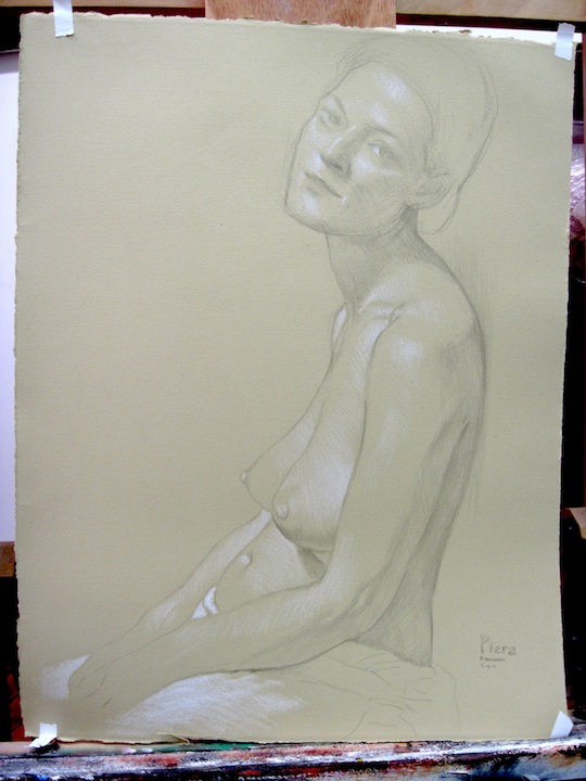
Preparatory sketch, graphite and white pencil on Rives BFK Tan paper, 22"x15"

This is how I always start a painting - it gives me time to evaluate the emotions my idea is bringing out, and whether or not the idea is any good. It also gives the model time to adjust the pose to match their own natural sense of position, which makes for a more organic unity in the eventual painting.

Then I agonized about what size to make the canvas - 30"x40"? This would result in a 9.5-inch face. It would be powerful, but not intimate. I'm not making a statement with this painting. I'm trying to put you in company with a person. I'm working on plenty of other paintings where the concept is more foregrounded (more on that soon) - this one is about character.

How about 28"x22"? A face about 5.7 inches tall. Intimate, but weak. Too weak. The viewer is too powerful.

Then I realized I had a 30"x24" lying around the studio. A face around 6.5 inches tall. Perfect.

So I did my usual finicky underdrawing on the 30"x24" canvas:


I try to take as much drawing out my painting process as I can with these underdrawings, but really, once I start painting, all bets are off, and the painting hardly ever winds up looking exactly like the underdrawing.

I wanted this painting to have mass, substance, presence - in short, I wanted it to have subsurface scattering. There's no way to do that but the long way around - layering paint over dry previous layers of paint.

I decided to start with a layer of Indian red (I kid you not) for the lights and burnt umber for the darks. Why? Because I know it works - I did it one time before. This is the Vadim painting where I used the same mix:

Vadim 1, oil on canvas, 20"x20", 2008

Only that's with all the layers in place. Here's how it looked before I painted in the lights - and the real darks (the version below actually still exists - I started over because I liked how the underpainting looked, and also three smart people in a row told me to stop where I was):

Vadim 0, oil on canvas, 20"x20", 2008

So I went into Monday's session with Piera having this plan in mind. And this is what I came up with:

Young Mother, sitting 1, 30"x24", oil on canvas

Now I really like that - I think the character and presence remain intact. I wanted her to be tired, and perceptive, and rich in mass, and slumped, and herself and nothing else. I think she's all of those things.

That was what made Monday a good day.

Wish me luck in not totally screwing it up as I go along. I'll share progress with you.

Thursday, May 12, 2011

The End of the Beginning

In this evolving inside-the-studio/outside-the-studio distinction, I feel we have spent a little too much time lately outside the studio, and I apologize for that. I will write more from inside the studio soon. But in the meantime, this being an art blog and all, let me draw your attention to the Second Battle of El Alamein. The "Battle of Egypt" was an 18-day confrontation during which Lieutenant-General Bernard Montgomery, leading the British Eighth Army, decisively routed Field Marshal Erwin Rommel and broke the back of the Axis's Afrika Korps.

Monty brings the pain, November 1942

The salient point in our context is that this first significant Allied* victory resulted in a speech from the irreplaceable Winston Churchill, during which he commented, "Now this is not the end. It is not even the beginning of the end. But it is, perhaps, the end of the beginning."

As you may know, I am a member of Saatchi Online, a site where an overwhelming number of artists post their work. I am lucky enough to have been selected from the talent pool there to show a painting at Gallery Mess, the restaurant of the Saatchi Gallery in London. This is the painting:

Hands #1, oil on canvas, 24"x24"

I am incredibly grateful to the people responsible for this decision at Saatchi Online and the Saatchi Gallery.

Many art people are better informed than I am - I am operating inside a complex system the elements and processes of which remain largely opaque to me. So any conclusions I reach about myself or anyone else are highly suspect. Nonetheless, I think I know enough to conclude that this Saatchi thing is rather a big deal - a big enough deal, that there is some chance Churchill's words apply. I have been working on my work in earnest for 13 years, and I continue to work on it today. As far as the second part goes, the part outside the studio - I hope that this is, perhaps, the end of the beginning.

*Not Allied, British - thanks for the catch, Casey.

Saturday, May 7, 2011

Jerry Saltz Kicks My Ass

My friends, let us turn our attention to yet another facet of the interaction between you making art in your studio, and your art making its way in the world. Today we'll talk a little bit about criticism.

Perhaps you've heard of Jerry Saltz. If not, have a taste of his career, courtesy of Wikipedia:

Jerry Saltz (b. February 19, 1951) is an American art critic. Since 2006, he has been senior art critic and a columnist for New York magazine. Formerly the senior art critic for The Village Voice, Saltz has been nominated for the Pulitzer Prize in Criticism three times. He was the sole advisor for the 1995 Whitney Biennial. Saltz has also served as a Visiting Critic at The School of Visual Arts, Columbia University, Yale University, and The School of the Art Institute of Chicago and the New York Studio Residency Program. He lives in New York City with his wife Roberta Smith, senior art critic for the New York Times.

Wow - pretty impressive, right? Which is why the English periodical ArtReview rated him as the 73rd most powerful person in the art world in their 2009 Power 100 list. This is what Jerry Saltz looks like:

left to right: Jerry Saltz, unidentified art enthusiast

This is his approximate rank relative to mine in the art world:


Something you would not necessarily guess about Mr. Saltz from this little summary is that he makes himself extraordinarily available for interaction on Facebook. He starts conversations and then, by god, participates in them. He can be hectoring, boisterous, overbearing, even bullying - but if you read a few of these conversations, you get the sense that he is not in it for the sycophancy. He's just honestly excited to trade thoughts on art and other topics with his thousands of Facebook friends.

Another thing to keep in mind about Jerry Saltz, in the context of this post, is that most of my art is really not congruent with his tastes in art, which skew distinctly more contemporary than my sensibility.

Be that as it may, I've been working on a few pieces lately which I thought might be closer to Saltz's sector than my usual work, so I figured I'd message some work to him for evaluation. He wrote back - and he's generously given me permission to share his comments here.

First I sent this message:

This is "Industrial Object #2," 36"x36", oil and silver leaf on panel. It's part of a series I'm working on - I'd be interested in anything you might have to say. I've got a tough ego; please don't feel obliged to say nice things.

All the best,

Daniel

A little while later he wrote back a single word:

Picabia

In case you're wondering, this is probably the type of work by Picabia he's talking about:

Machine Turn Quickly, Francis Picabia, 1916-8

Picabia wasn't actually on my mind, because I mostly know him from quotations by Tristan Tzara which I've gotten confused with quotations by Picabia. Actually, no one was on my mind when I devised that painting, but to the extent that I've admired machine art by anyone, it's Jim Dine:

totally bad ass pair of scissors, Jim Dine, probably sometime after 1970

Let me remind you of my approximate rank in the art world relative to Jerry Saltz:


I considered that, and then I wrote back:


Thanks - not bad company. Here's the first one from the series. Want me to send more as I complete them?

He wrote back:

Picabia IS great company; your paintings look good (the first more mysterious and therefore better than the 2nd), but I should NEVER be thinking of ANOTHER artist in front of your work MORE than I am thinking of YOUR work.

You HAVE to make this work more your own. I am not an artist. I do not know how you should go about this.

There's a moral to this story, and I'm getting to it. But first, let me explain to you that considerations of relative rank only go so far with me. If somebody is willing to have a conversation, I find that I'll wind up slipping into some kind of comfortability with that conversation relatively quickly, no matter who they are. So I sent a few more paintings to Saltz. Let me share these paintings with you, and Saltz's thoughts on them:


Saltz:

This one is just generic photo-realism with a little more fracture and brushiness. Somewhat sensationalistic. Somewhat sexy. Generic.


Saltz:

This one just looks like 1000 other realist somewhat surrealist nudes.

It seems utterly impersonal and without risk or originality.
You have good craft. Which is something.
The first one you sent me is still the one I like the most. Something to do with the whiteness, the unfinished field, the mystery of the shape or subject, the closeness of the values of gray to black...

None of this means that your work is no good. It only means I don't like your work.

Good luck.

Jerry

Shortly after, he added:

Make the drawings for the atlas your art.... let them become something, larger, more alive. (I did not look at any of these. I only looked at yr. bio and noticed the words "atlas of anatomy"...)
Atlas into art is a way to your obsession. Obsession is the skeleton key to art - NOT crafty. Craft leads to craft...

Not content with this ego-bruising series of responses, I went ahead and sent him these two:


He had this to say:

These works are not about anything.
They are as impersonal. They look very unoriginal.
This does not mean that your work is no good; it only means that I do not like your work.

Jerry

If you've been following my work at all systematically, you will notice that at this point I had sent to Jerry Saltz at least one example of each of the major threads of my current exploration - the machine paintings, the sex paintings (have we talked about those here?), the highly-rendered nudes, and the washy color paintings (I don't think we've talked about those either). And he took the time to test them against his own sense of art and aesthetics and let me know how they stood up for him.

How did all this make me feel? I'll level with you. It did not make me feel as good as a back rub from Nastassia Kinski. Here's the moral of the story - that doesn't matter. If you are making art in your studio, but you want your work to one day stand on its own in the world, then you have absolutely got to learn how to take criticism, even scathing criticism, and recognize that it is a net positive - that it is something you can learn from.

I'm not saying that all criticism is valid, fair, or moral. I know a couple artists who have had dealers rip into their work for extended periods just because the dealers were sadistic assholes who felt a need to let off some steam. That's invalid, unfair, and immoral criticism, and nobody should feel a need to put up with it.

But that's not the kind of criticism we're looking at here. This is criticism you can learn from, once you get a solid half nelson on your vanity. What did I learn?

Well, first of all, I definitely learned which future shows not to invite Jerry Saltz to.

But I also learned something important about my work itself. Once I had separated out the stuff that I'm unwilling to apply - the basic dislike for most of the idioms I'm working in, to which I intend to remain committed - there was one key observation which is well worth thinking over:

Your paintings look good... but I should NEVER be thinking of ANOTHER artist in front of your work MORE than I am thinking of YOUR work. You HAVE to make this work more your own.

I am aware of this issue. It goes back to the authenticity problem we discussed near the beginning of this blog. I admitted in that post, and I'll admit again, that many of my arguments against a radical personal style may be self-serving because, essentially, I haven't got a radical personal style. I tend to run with a gang of painters - semi-academic figurative painters - who have a huge doctrinal beef with the centrality of the distinctive personal style in the pantheon of artistic values. That allows me to frequently not think about the issue, but it doesn't make the issue go away.

The mighty artists really are recognizable from their works. I am not, yet. I don't think, without knowing the hell out of my work, you could walk into a room of paintings, point to one, and say, "There hangeth a Maidman."

I've probably said before that you can't force these things. You can, but then you wind up with a synthetic style, which definitionally excludes authenticity of vision, since all vision is sent chugging through a kind of image-processor to make it fit a mechanical picture schema.

There is only one path past the issue, and that's through it. The path through it as a matter simply of going on making art, and seeing what happens. You can guide your hand a little, but you can't think your way out of this particular problem.

What I learned from Saltz's criticism is that this issue is not my personal little secret. Even if he got the terms of reference, by my lights, thoroughly wrong, he grasped the fundamental issue. And this means that the fundamental issue will be clear to anyone with a sufficiently developed sense of taste.

This is not to say, as Saltz comments, that my work is no good. Heck, I think it's great. But it lacks a particular virtue which I will reluctantly concede is worth gaining. So his criticism points me toward something to think about quite seriously.

Back to the moralizing. Imagine for a moment that you're an artist who, like many artists, takes criticism really badly. Let me remind you again of my general art-world rank relative to Jerry Saltz:


Jerry Saltz just kicked my ass up and down the block. And I am very grateful for his generosity in turning his much-in-demand eye on my work long enough to genuinely see something about it. If I can do it, you can do it. Your vanity is your enemy. Your will to become better is your ally. Never be afraid.

Thursday, May 5, 2011

Egyptian Space

Can we talk for a minute about the representation of space in painting?

Actually, before I begin, let me admit that, as usual, I come to this topic armored with my obsidian ignorance, so please take any claims I make, or conclusions I reach, with a large tablespoonful of salt.

Anyway - the mainstream Chinese, Japanese, and Western traditions of space representation are all approximations of space as a coherent three-dimensional physical phenomenon:

Ni Zan (Chinese, 1301-1374), Landscape


Miyamato Musashi (Japanese, 1584-1645), Landscape


medieval European painting - sorry I don't have better information, I just really like this picture

The Chinese and Japanese system of aerial perspective was developed as an expressive end in itself. The Western aerial tradition struggled toward mathematical perspective, which, as we all know, they finally cracked during the Renaissance:

Raphael, School of Athens, 1510-11

The assumption has always been that the goal is a faithful depiction of the actual euclidian geometry of space in the Earth environment, and modern Western pictorial methods have both achieved this goal, and explored its available variations in creative and fascinating ways -

Euan Uglow, Girl Tree, 1989-91

Euan Uglow attempted a non-geometric rendering of shallow spaces based on an intuitive concept of pure optics which he nonetheless expressed in a mathematically precise manner.

Francis Bacon, Pope II, 1951

Francis Bacon became fascinated by the idea of space-as-concept, rendering spaces in wireframe in order to lay bare the intellectual content of our acculturated concept of three-dimensional space. He imposes the grid on an amorphous void, expressing his concept that order is a weak imposition of the mind on a chaotic and hostile universe. We see the same wireframe premise taken up, from a much more optimistic point of view, in Hockney:

David Hockney, Model With Unfinished Self-Portrait, 1977

Hockney later rebels against coherent three-dimensional space, but his shifting-perspective photographic collages are a reaction to Western space, and therefore represent a part of the paradigm, not an independent creation:

David Hockney, Kasmin, Los Angeles, 28th March, 1982, you guess the date

Hockney's photographs descend from the body of thought called Analytic Cubism, a corpus so complex and so peripheral to my theme that we will conspicuously fail to consider it here.

Escher generates imagery as a means of expressing mathematical concepts of space, and takes advantage of very sophisticated representations of space, such as the use of sinusoidal curves rather than straight lines to mimic the mapping of perspective over the field of a shifting glance:

M. C. Escher, Treppenhaus I, 1951

Be all that as it may, a single assumption underlies all of this work - that space in the image should reflect physical space in the scene depicted.

This is not the only way to represent space in an image.

Consider the fascinating case of ancient Egyptian wall painting:


This is from the Metropolitan Museum's set of reproductions of New Kingdom paintings. Several familiar features are visible in this image:

1. The mingling of text and figure.
2. The representation of rows of figures in a manner similar to a writing system.
3. The depiction of figures at a variety of scales.

The third statement interests me particularly. It could be argued that the bottom row of figures, separated by a line from the main scene, occupies a separate space and that the reduced scale is thus motivated by a difference in the space depicted.

But the small figure on the left offering an object to the large male central figure clearly occupies a single space with the main figure. So what does the inconsistency in size tell us? That the little figure is less important than the big figure.

In a physically realistic depiction of space, smallness of figure is proportional with distance from vantage point. In the Egyptian depiction of space, smallness of figure is proportional with lack of importance.

Combine this with the arrangement of figures in rows, like letters, and what kind of space are we looking at? Not a physical space, but a narrative space:


Egyptian pictorial space is a space determined not by physical reality, but by narration of events. Figures are grouped to depict processes, and the relative importance of objects and participants is indicated by scale. It is a powerful and strange space, using physicality not as an end in itself, but rather as a bare-bones means of expressing intellection.

Hybrid paradigms of narrative and physical space occur in Chinese, Japanese, and particularly Persian painting:

Persian illustration from manuscript of the Shahnameh

But the pure narrative space, totally divorced from physical context or consistency, is the realm of Egypt.

I have occasionally considered the applicability of this mode of spatial representation to my own work. In doing so, I have reflected on other modern-age artists who, intuitively or not, have worked in the realm of Egyptian space. The key example, when you think about it, is Keith Haring:

One of four bazillion Keith Haring pictures

Haring's work has the character not of a fully-formed image space, but of a semiotic map.

Another one

This mode is expressed, in looser form, in Basquiat's quasi-linguistic work as well:

Jean-Michel Basquiat, Self-Portrait, 1982

The linguistic thread is taken up again in the peyote-trip sequence in Beavis and Butthead Do America, which to me includes one of the most astounding bits of cinematic grammar of the past twenty years - the abrupt conversion of the picture frame from a perspectival "window" into a flat linguistic sheet:

Mike Judge, Beavis and Butthead Do America, 1996

For moving closer to a physically representational paradigm, while maintaining radical distortions based on intellectual emphasis, we have Matisse:

Henri Matisse, The Red Studio, 1911

And Van Gogh, particularly in his room at Arles:

Vincent Van Gogh, Room at Arles, 1888

But there is a limit to the possibility of the hybridization, as demonstrated by yet another accidentally bizarre Ingres painting:

Ingres, Jupiter and Thetis, 1811

In this painting, Ingres uses the concept (there's a cool word for it, which I forget) of representing the Big God as physically bigger than whoever else is in the room. At the same time, he uses his typically idealized high-gloss rendering of physical reality. To me, this combination doesn't really cohere into an organically unified work. The conceptual fracture makes it fascinating, but it doesn't yield a synthesis.

Why not? Let's go back to Egypt:


Consider the figures - perhaps the most famous aspect of Egyptian art. They are stylized, simplified, always seen from certain characteristic perspectives (profile head, frontal torso, profile legs), and repetitive. I would contend that for a picture to work, its degree of participation in narrative space must be accompanied by a parallel degree of divorce of represented objects from physical realism. Physical realism has its home in physically realistic space. In fact, one evokes the other - a law which Ingres tries, and fails, to break. To demonstrate the evocation, even when the element of space goes undepicted, consider the figures in the Elgin marbles. They are relatively naturalistic, and if you ask, "Where are they?" you will picture a physical space:

Elgin marbles - north frieze

Contrarily, true narrative space requires narrative physical elements. More simply, the figures in Egyptian paintings are not figures. They are letters.

So if I want to use Egyptian space, I have to come up with a mode of representing the figure which is consistent with the demands of the space. I actually did this accidentally in a few early life drawings:

Thirteen Pictures of Kem, 1/11/2002,
pencil and gouache on brown paper that proved sadly oil-stained
when I dredged it up from the deep archives, i.e. a plastic tub under the bed

These figures occupy a single scroll-like space, not only because of their arrangement on the paper, but because of their simplification into stylized forms.

Thanks for taking the time to consider these ideas with me.