
I’ve long had a problem with the surfaces of my paintings. I like how they function as representation, but I don’t quite like them as physical objects. The paint is too thin. It has little or no tactile presence; it does not say “I am here” or “touch me.” This deficit has been a low-level background irritation for years. In the foreground, I worked on improving my techniques. But I had an anxiety about the lack of sensual presence of my work. It felt not quite real.

Blue Leah #11, 2012, oil on canvas, 24”x24”
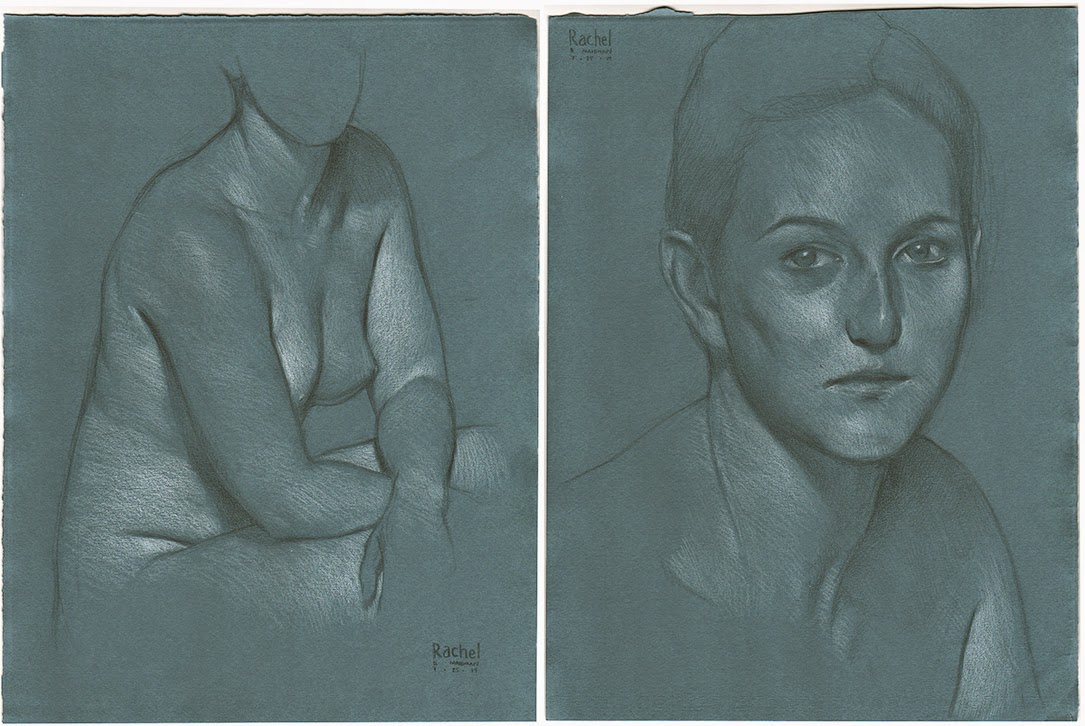
This situation could have gone on indefinitely, but I encountered a startling chain of inspiring events. First is a precursor process: for the past year and a half, I have frequently drawn a model, Rachel, at Spring Street. Rachel is a dancer, and has a massive and powerful body, particularly her upper legs.

Rachel Reclining, 2013, pencil on paper, 15”x11”
I absolutely loved drawing Rachel, and decided to do a painting of her, the first full-length life-sized figure I had felt inspired to do in a long time. I pictured the painting as drawing on her overwhelming physical presence, and reflecting it with warm earth tones, a clay wall background, and a unified, classical pose. This was going to be the first of six paintings, which is why it’s called The Hexagon 1a.

The Hexagon 1a, 2013, oil on canvas, 72”x48”
However, that same ethereal quality overcame the piece. This made me incredibly upset. I wanted it to feel corporeal, fleshly, real. But it felt like an image rather than a thing. Stung, I abandoned the project, and moved the dilemma of the weak surface closer to the front of my mind. No solution presented itself. Or, rather, the solution was always obvious but I could not accept it and focus on it yet.
Around this time, or a little later, the Met had a show of Balthus paintings. Balthus is a really mixed bag; my favorite work in the show was the drawings of his cat Mitsou, allegedly made when he was 11. Given their pictorial maturity, and that his mother shepherded them to publication with her buddy Rainer Maria Rilke, I am inclined to suspect that they are her work, cleverly ascribed to him to boost their star quality. This, for instance, is a “self portrait” crying after Mitsou has run away, the last illustration in the sequence. If Balthus drew it, nothing he made before or after reached not only the degree, but the kind, of direct pathos and unflinching self-awareness displayed here.

Balthus, Mitsou drawing #40, 1919, black ink on paper, 6”x5”
That’s not really my point though. There was a painting in the show, The Victim, which, sadly, I could not photograph, and of which there is no good reproduction online. So here’s a bad one.

Balthus, The Victim, 1939-46, oil on canvas, 52”x86”
This is an enormous painting, the woman dauntingly and tantalizingly life-sized. What struck me was the paint toward the top of her belly, just below her rib cage. It is a thick impasto. It has a texture to it, and this texture is delicious. It is simply wonderful, possessing all the physical presence that I was craving in my own work. I became absorbed in this texture, soaking up everything I could about it.
Although I could not photograph it, the texture was by no means unique, so I can show you what I’m talking about. This is from the forehead of a portrait by van Dyck, courtesy of this excellent blog post: http://www.studiorousar.com/2011/10/30/head-on-a-platter/

Anthony van Dyck, Portrait of Cornelis van der Geest [detail], 1620, oil on oak, 15”x13”
Visible here are pale tendrils edged with darker regions. They look like waves frozen as they crested, and in a sense they are. Solids with this structure tend to be composed of long molecules. As they oxidize, they harden, but their length allows them to retain some of the dynamic-looking structure they had when they were whipped-up fluids.
Oil paint is mainly a mixture of pigment and oil. Multiple websites on the kind of impasto we see in the van Dyck painting report that this particular texture results from lead white paint made with thickened or “bodied” oil - this means the oil has been exposed to light or heat to begin its oxidation process. Its small molecules have already begun to polymerize into larger molecules, the beginnings of the hard oil film of a dry painting. This makes the paint sticky and allows it to retain the sculptural qualities imposed on it by the painter’s brush.
I stumbled out of the Balthus show, ears ringing as if I had been punched - this was what I needed to do! In a sense, I could only learn this from Balthus, and not from the Rembrandts displaying the same techniques only a few rooms away. Why? Because Balthus, when you get right down to it, is a mediocrity. He did one thing brilliantly, and that was to render himself like so much fat; he melted down his neurosis about young girls and made a crystalline observation of his own deformity. Apart from this single shining achievement, as much moral as artistic, he is an indifferent painter. And yet his impasto lends mass and dignity to the figures in which it appears. It makes something monumental out of the otherwise trivial.

Balthus, The Room, 1948
Balthus’s lousy painting clarifies the influence of the impasto, as if he were constructing a single-variable experiment. In Rembrandt, any of a thousand brilliant techniques, touches, and ideas could lead to the bedazzlement of the work. In Balthus, there is very little apart from the impasto. Its thundering impact clearly belongs to itself and nothing else. This is highly instructive.
Therefore I stumbled out of the show, ears ringing. The way forward was challenging, but clear!
Naturally, I went to the gift shop next, because that’s what you do before leaving an art museum. And here the final event in the inspiring chain took place. I came upon a sculpture reproduction from behind.

Jane Poupelet, Woman at her Toilet, 1909, bonded bronze reproduction (my photograph)
This graceful back, so streamlined and feminine, so powerful, was very like Rachel’s back. When I say that Rachel is massive, I don’t mean that she weighs a great deal. I mean that she has the aerodynamic might of art deco aesthetics. Her build seems designed by the same elegant hand that made the locomotives, the skyscrapers, the lights, and the bridges of the 1920’s. The heart of deco was simplified mass-production design, seeking to imbue everyday objects of the industrial age with a formal beauty affordable and appreciable to the common man. Deco was optimized for strength and mass, youthful and electric with hope. This sculpted back suggested all these things to me, and suggesting them, recalled Rachel’s back.
Abruptly, the circuit closed. My long-standing interest in impasto meshed with my interest in finding a suitable way to paint Rachel. From being two things, they became one thing.
I knew what to do next, but I didn’t know how to do it. I took to Facebook to ask around about impasto techniques. This generated a bewildering profusion of suggestions, but I went with Dorian Vallejo’s recommendation of Oleopasto - a modern thickener, analogous to bodied oil. It turned out to be similar, in practice, to fast-drying vaseline.


The positive goal was to further texture the hashed-up sensual surface I was working toward.
The negative goal was to disrupt my anticipated tendency to go back to smooth, blended, thin brushwork. I wanted to enlist anything I could to keep that from happening.
So I got over my thing about the heavy canvas and found some. I started alone, as I often do when using a radically new process with which I am likely to fail embarrassingly and expensively. I painted a small painting from a reference picture of Rachel’s back I had taken for some other work we were doing together. I used my knuckle-dragging, ball-scratching canvas, and plenty of Oleopasto and broken brushwork.

Rachel’s Back, 2014, oil on linen, 24”x18”
Now, I don’t think this is bad at all (happily, it was not-bad enough to make it into the highly competitive annual show of nudes at MANIFEST, an arts organization in Cincinnati which I admire very much). Here’s what I think works: it has the very quality I was seeking. It has body. Take this section of the right shoulder.

Rachel’s Back [detail], 2014, oil on linen, 24”x18”
The canvas imposes a deep set of bumps and valleys, and on top of it the Oleopasto layer ridges the surface, and the paint proper adds a final layer of textured directionality. The paint physically comes forward from the canvas. It has sensual presence. For all that, it seems like a first effort to me; in tackling the new territory, my other skills were thrown years backward. Here’s the Rachel painting I did immediately before this one. It’s the same size as Rachel’s Back.

Rachel and the Colors, 2014, oil on panel, 24”x18”
Compare the fluidity of anatomy and pose in Rachel and the Colors and Rachel’s Back. In Rachel’s Back, I cleverly concealed my clunky draughtsmanship with a centered and monumental figure - nobody expects dynamism from that sort of figure - see Balthus’s The Room above. The anatomy is simplified and unsubtle, and the crudity of the form seems to me to act against the complexity of emotion I usually see in my work. I sacrificed a great deal to reach that force of surface, that sense of thing instead of image. But I am hoping, with practice, to claw my way back to much of the rest of my vocabulary as well.
This first attempt was not the back painting of Rachel that I meant, that illuminating morning at the Met.
So I practiced. I painted a few more paintings, with mixed results. And finally, having forgotten the original inspiration, I came on my own to the same figure I saw in the gift shop. Noodling around with ideas for paintings of Rachel, I had her sit curled up and I drew this:

Preparatory Sketch for a Painting of Rachel, 2014, pencil on paper, 15”x11”
This was a brutally difficult drawing to do. I could not get the relative heights of her back and her butt right. I kept screwing around with the basic drawing, making myself crazy. And all this time I did not think about the sculpture in the Met at all. A true theft should be unconscious, don’t you think? If it isn’t, how are you supposed to take ownership of the stolen work?
Anyhow, I was going to paint something else, but at the last minute, I decided to paint this instead. I had finally found a stable source for pre-stretched pre-primed burlap canvases: the Odessa line from Jerry’s Artarama (although given that it’s Ukrainian, who knows how long it’ll be around).


Large Portrait of Rachel’s Back, 2014, oil on linen, 40”x30”
That, amici, is exactly the painting I meant. Once it was done, the charm lifted from my eyes and I realized I had painted the thing I saw when, ears ringing, I stumbled out of the Balthus show.
So - what do you do from there? I suppose you continue building, and that building never stops. I decided to paint a companion to this one, making use of these tools to express something more involved - not better necessarily, but harder to do. Here are the preparatory sketches, which I liked very much. The figure seemed to me to take on a rhythmic sequence of lights and darks, while the face expressed very much of the shining humanity which makes faces, in their endless uniquenesses, fascinating to me after all this time.
Preparatory Sketches for a Painting of Rachel, 2014, both pencil on paper, 15”x11”
I whipped out another 40”x30” swaggering Ukrainian gangster of a canvas, and got to work. Again, it was a two-session painting - six hours working live with Rachel, maybe another four messing around on the canvas without her present. I didn’t know what to call it, but that question answered itself. Rachel is going through one of those cursed corridors we all must weather eventually: one after another, people important to her are dying young. It is a terrible thing to endure, and terrible to observe from outside. She is having the worst hard time. On the day that we did the face, she was coming fresh from finding out about another death. Her conversation and her gaze kept drifting into her grief. Instead of asking her to present a different face or hiding from it in the work, I tried to paint how she was then. So I called it Rachel Grieving.

Rachel Grieving, 2014, oil on linen, 40”x30”
Stepping back from its dramaturgical meaning to its formal properties, I maintained the rhythm of light and dark while focusing the light along a central axis, from the highlights on her legs up to her face. I used the texture of the Oleopasto and the overlying impasto to convey presence and mass, in her powerful legs and mighty ribcage. This is not so fluid and graceful as the portrait of her back, but to me it still has that thingness I am always chasing.

Rachel Grieving [detail], 2014, oil on linen, 40”x30”
The paint is thickly built here, and the drawing is simple and inaccurate. That’s alright. I don’t need the thing to be sophisticated or clean. I will go on suffering pangs of envy when I see artists doing that, but in this particular instance I chose not to attempt it, and I have to live both with what that loses me and what it gains me. The loss is an appearance of clumsiness and lack of facility. But I think that the crude work gains me a certain emotional force I could not personally otherwise access. Her eyes glisten as they slide away from us. Her mouth pushes forward slightly, and her lips are a thin tense line. This to me is a picture of a person suffering, and it is neither more nor less than what it needs to be. I asked for Rachel’s permission to make this so much about her awful passage, and she gave me her permission. She was glad, it turns out, to have a memorial of it. I would perhaps be a better artist if I took without asking, but I do not have the stomach to be better at that price. And I can get most of what I want without becoming a bully or an outlaw.
Next time we get together I’d like to talk with you about Stephen Wright’s very sensible objections to what I am doing with my so-called impasto, and my response to that. But for now, I’d like to talk again about something that has come up throughout the history of this blog, and that is the question of assertion. As you know by now, I believe that art must not come humbly up to you, begging to explain itself. It must assert itself, often recklessly and without explanation, nearly to the point of assault.
Two instances of assertion link themselves for me now in a way that they have not in the past. Both have made a strong impression on me. First, Marsden Hartley’s Madawaska—Acadian Light-Heavy, a large oil painting I saw at the Art Institute in Chicago not long ago:

Marsden Hartley, Madawaska—Acadian Light-Heavy, 1940, oil on hardboard, 40”x30”
The edge of light on his left arm (picture right) is what struck me. It is such a ridiculous pictorial streak of light, slightly plausible but really just there to make that arm stand out from the dimness. It originates in a purely utilitarian purpose, and it is transparent about this purpose. This very transparency turns it into art. It is a naked assertion of the power of the artist. It demands respect because it does not justify its presence on any aesthetic grounds at all; this, paradoxically, is what makes it an unanswerably self-sufficient aesthetic mark. The utilitarian, filtered through the intentionality of art, attains the enigma of the arbitrary. There is a good chance that the most profound images are arbitrary. Looking backward, one finds that no road leads to them. They simply are.
This same exact edge of light, transformed from the utilitarian to the arbitrary, made a lasting impression on me many years before - in 1999, in fact. It was a particular shot in the The Matrix, a shot which is never far from my mind.

The Wachowskis, The Matrix [still], 1999, motion picture
I direct you here to the edge of blue light on Morpheus’s jawline picture right. This is a movie. That didn’t just happen. The cinematographer, Bill Pope, decided to separate the shadowed side of Morpheus’s face from the equally dark background, so he put up a light to edge his jawline. In itself, this is not so surprising. It’s a classic technique dating to the earliest days of studio-shot Hollywood movies. It’s called a kicker. What makes this particular kicker so special is how understated it is. It’s barely there, and yet it is there enough. It trusts itself to be no more nor less than is absolutely necessary. This little tiny kicker is a poem in the plainly visible but little appreciated language of cinematography. It forms its own island of the aesthetic in the multi-channel maelstrom that is any movie. In its dimension, it makes the same leap from the utilitarian to the arbitrary as Hartley’s rim-lit arm, and for the same reason: strength of assertion.
These two images swam back into my mind, and linked for the first time, as I was painting the large painting of Rachel’s back. Her dark hair was threatening to vanish into the dark background. I didn’t want that, and I thought, “What the hell, I’ll put in a rim light.”

Large Portrait of Rachel’s Back [detail], 2014, oil on linen, 40”x30”
There is no physical justification for that rim light at all, and no particular reason you should notice it. It is nothing much for you. But for me, it was a tiny marker on the path to assertion. I have been many things in relation to art in my evolution as an artist: lover and beloved, disciple, analyst, supplicant, celebrant, receiver of visions. But in relation to art as assertion, I am a predatory closed loop. I am and always have been a hunter hunting myself.