One of the things I love about Daniel Maidman’s blog is his consideration of scientific aspects of art, including the study of human perception, something I’ve been interested in for a long time. (Daniel’s posts on edge detection are particularly worth reading.) So I was honored when Daniel suggested expanding my comment on his recent post “The Integrated Visual Field” into a guest post.
This is basically a summary of what I’ve managed to learn, as an observational artist and as an interested amateur, about how human visual perception functions in drawing and painting from life. I’m not a professional scientist. If you are, and you find something inaccurate or misleading here, please offer a correction via comments.
The fovea is the area of the retina (the “sensor” in the eye) that has truly sharp vision:
It only covers an angle of view of approximately one degree. This is described as the size of a quarter seen from four and a half feet away (on this website). Moving out from the fovea, retinal acuity (as well as color discrimination) drops off steadily and rapidly.
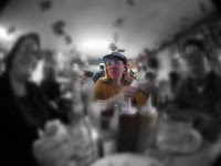
 totally trippy render of relative acuity of fovea and surrounding areas
SOURCE: http://fredhatt.com/blog/2010/06/20/exercising-perception/
By the time it reaches the area of the blind spot, which is about 20 degrees off center, acuity (sharpness) is less than one-fifth of what it is at the fovea. So even at a distance of several feet, you're barely able to really take in a drawing in a glance. And in looking at a model, seeing details can make it hard to see the whole – you can’t see the forest for the trees. I know of two techniques for overcoming this limitation of the eye, both commonly used among observational artists. The first is to defocus or squint the eyes. This actually disables foveal sharpness, which frees up the visual cortex to take in more information from the fuzzy peripheral vision, thus making it much easier to get an overall sense of large shapes – the whole drawing or the whole model.
The second technique is to keep the eyes moving. This is actually essential to the way the visual cortex works. Since the high-acuity area of the eye is so limited, the eyes naturally dart around like hummingbirds (saccadic movement), and the details that are picked up as the eyes move are assembled in the visual cortex as a kind of mosaic. In this way the visual cortex seems to have a much higher resolution than can be accounted for by the rods and cones of the retinas.
Saccadic eye movement is generally an unconscious process, but you can consciously try to keep your eyes moving as much as possible while drawing.
And if the glance also alternates frequently between the model and the drawing or painting, the subject and its copy are always being compared, the two perceptions mentally superimposed. If you observe artists drawing in a life drawing class, you are likely to notice that the more accomplished artists look back and forth between model and drawing much more than the beginners.
These techniques have their limitations, of course. The shift between near and far focusing, the angle of the drawing surface, and the dulling of perception that grows with familiarity can all cause distortions to enter into the work.
Most artists use some combination of darting eyes, squinty eyes, measuring (with pencil and thumb or with grid), optical aids, sight-size technique, canons of proportion, anatomical knowledge, perspective techniques, angular relationships, alignment with background elements, etc., whatever combination works for the individual artist and situation.
I think most artists have a scale that feels natural to them. Some like to draw small and others like to draw large. Going against one's natural scale is one of the best exercises you can do. I suspect these natural scales have as much to do with an artist's kinesthetic sense of hand and arm movments as they do with one's way of seeing.
Kinesthetic factors may enter into the experience Daniel had (described in “The Integrated Visual Field” post) of getting different results in drawing with the paper at differing distances. Maybe when you are seated and the paper is close to you, there is a much bigger difference in the feel of the hand moving at the top of the drawing board as compared to the bottom of it, whereas when the whole board is at arm's length, the movements of the arm and hand are more uniform. I think that could be a major factor.
Next we'll look at some thoughts from Steve Wright, elaborating on a perfectly obvious point which I completely overlooked, despite being well-acquainted with the phenomenon he describes. In some ways, I was overthinking the issue. As an aside, I often worry that my authoritative way of writing things urges you, reading this blog, to accept that what I say is true. Steve has a quality useful in dealing with me - he doesn't buy most of my bullshit. I encourage you to always consider for yourself whether you're convinced by what I have to say. Half the time, I'm not convinced myself. Regarding overthinking, I have a funny story for you after we read Steve's comments:
Well, it might be the case that distortion in drawing (or painting) comes from going outside an integrated visual field (which you say is a brain thing), but at least from my experience, drawing and seeing myself and classmates hit this problem over and over again, it can come down to a much simpler problem: perspective (an eye thing).
When you're drawing close to the paper, the farther up and down you draw, the more you you're drawing at an angle, so the space becomes condensed. I've done it thousands of times and know that's the reason - in fact that's why Kem's arm is so long: because when I'm looking down the paper at an angle and drawing, her arm looks properly proportioned. It's only when I stand back I see the arm is too long.

Like I said, I've probably done this, on purpose or by accident, every time I've gone to a session (especially since I like long format). In fact by the time I drew that drawing I knew what was going to happen and just did it on purpose for fun.
So mostly I think bad proportion (lack of talent notwithstanding) is from lack of standing back far enough - maybe because of the integrated field, but definitely because of perspective (in class we were taught to avoid this early on, hence we learned that good drawing involved your whole arm and body, not just your hand - people that just leaned on their drawing pad and myopically drew with little scratch marks from the wrist never had good proportion).
Also, I've learned (probably from laziness or boredom - I remember John [Steve's late teacher - ed.] tearing the edges of his paper once he had a drawing almost complete, just so he had to fight the composition more and make it more engaging to him) to track the proportion and dimensions of one form to the adjacent one; so I draw by starting with the hand, then the arm, then shoulder, head, etc. In theory I am able to keep the proportions fairly accurate throughout, but it's often more interesting to play with the proportion problems that result and let things happen that way. Instead of reproducing the body's composition, you're sort of inventing a new one. Schiele does that beautifully.
It's the same thing as John tearing his paper - these things come out of boredom because you've just done something so often - so you start playing little games with yourself - you start to invent.
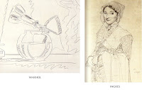
I happen to believe Hockney's theory. I see things in Ingres and Holbein paintings that, once you look at it that way, in my opinion couldn't have been done any other way. Hockney wrote he first thought about this when looking at a Warhol drawing he knew had been drawn from a projector - the lines were spontaneous yet looked like the artist knew exactly where to place them - they had a quality of knowing. When he looked at Ingres drawings, his lines had that same knowing quality.
 Hockney versus Ingres, ripped off from:
http://www.gwennseemel.com/index.php/blog/comments/tracing/
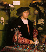
It's a subtle thing only someone who's drawn all their life, and knows what kind of lines look like what, can see - I see what Hockney sees in those lines and am convinced they were done by projection of some sort. Many passages in Holbein paintings have distortions that look specifically like lens distortions and not just general inaccuracies. Just me though.
 Holbein
Georg Gisze, a German merchant in London
1532, oil on wood, 38 x 33 3/4 in, Gemaldegalerie, Staatliche Museen, Berlin
I've highlighted in blue inconsistent perspectives on parallel lines in the cloth.
Thus Steve. He's right about the paper angle issue, and I'm half-convinced by the Hockney argument he cites. I just wish Hockney had, you know, some documentation. So, as regards paper-angle versus integrated visual field: this is strong evidence for overthinking. I'm not saying I'm wrong, but rather, that the phenomenon Fred mentions, and Steve elaborates on, is definitely true (I've noticed it myself) and weakens my argument. As usual, I am grateful for the things I learn from people who have read this blog. Thank you very much, Fred and Steve.
And the funny story about overthinking I promised you: My all-time champion bit of overthinking was in a midterm for a course I once took in Jewish intellectual history. The midterm included this assignment:
Identify three doctrinal factors which contributed to the split between Christianity and Judaism.
"Wow!" I thought. "That's a tough one!"
I mulled it over, and came up with:
- the dispute over the kosher laws
- the thing with the calender system
And one other totally trivial point which I can't remember now.
When I got my midterm back, the wry professor had given me full marks, and noted:
While these are correct, I would also have accepted such items as the Trinity, the divinity of Christ, and the resurrection.


Thinking about blogging about all this myself, maybe sometime soon.
ReplyDeleteSize in art work is something rarely talked about, so much so that some art books don't even print the size of the artwork (which annoys me no end!).
This is probably because it is something fundamental for artists to consider, and largely irrelevant to buyers.
My personal comments (not yet fully thought out!) is that initially I was a big drawer (A2 watercolours of flowers!) and have progressed to smaller and smaller over the years. This process been speeded up by an inability to lift my drawing arm up to shoulder height over the last year, compelling me to draw and paint everything at lap level.
And what I have discovered is that if you are drawing in this position you have to draw small. Anything bigger than A5 gets distorted. This means frequent getting up, propping it up vertically and looking from the other end of the room. Not easy in a life class.
Also, the medium you use comes into play - watercolour and line drawing is hard to manage in big, whereas the reverse seems true of charcoal. Part of this, of course, is that the bigger you go, the more likely you are to need to correct proportions.
So my addition to the discussion so far is that a lot of these decisions are logistical and not entirely expressive/creative/whatever.
Jane -
ReplyDeleteHi! I hope you'll send me a link to the blog post if you write it, I sometimes get a few behind and I'd hate to get there late.
I do think buyers think about size a bit, just because they have to figure out if it'll fit over the sofa.
I actually thought your work was much larger than it was when I saw it in person - it looks big on a computer screen. A lot of models are surprisingly short when you stand beside them too - big personalities. Your work has a big personality, Jane. Commands a room.
I don't know how anyone does small charcoals. They're a nightmare small. And I think you're right, I don't like to work over 20x15 in pencil.
Conclusion: yes, logistics plays a huge part in size. Thanks so much for the thoughtful comment, and I hope your art is going great. Did I tell you I've got your life drawing up in the studio?